Screenshot sizes for social media
Every platform crops and compresses differently. These are the sizes that survive.
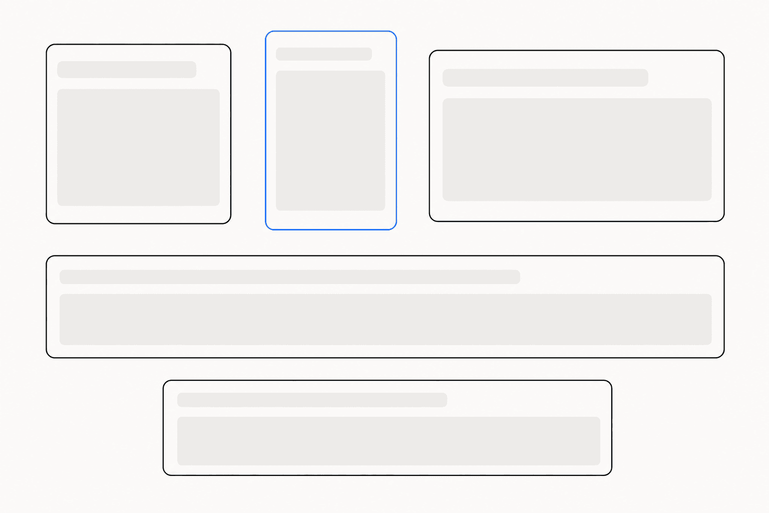
Upload the same screenshot to three platforms and you get three different results: cropped on one, letterboxed on another, compressed into soft mush on the third. Screenshot sizes for social media are not a matter of taste. Each platform favors specific display dimensions, and any image that arrives at the wrong size gets resized, re-cropped, and recompressed without your input. The reliable fix is to export to a short list of known-good sizes and give the platform as little work to do as possible.
Screenshot sizes for social media: the reference table
Six sizes cover almost every place a product screenshot ends up. They map to four aspect ratios, and the ratio matters more than the exact pixel count — it decides how the platform crops and how much of the feed you occupy.
| Placement | Pixels | Aspect ratio | Where it works |
|---|---|---|---|
| Social square | 1080×1080 | 1:1 | Feed posts everywhere; the safe default |
| Social portrait | 1080×1350 | 4:5 | The tallest widely supported feed format |
| Social landscape | 1600×900 | 16:9 | X timeline, video thumbnails, wide announcements |
| Open Graph | 1200×630 | 1.91:1 | Link previews on most platforms and chat apps |
| Chrome Web Store | 1280×800 | 8:5 | Store listing screenshots, exact size required |
| Blog hero | 1600×840 | 40:21 | Article headers, newsletters, docs banners |
These six are also exactly what ReadyStill's Launch Pack ZIP exports in one click, so one finished screenshot covers a launch post, a link preview, and a store listing without manual resizing.
Aspect ratio decides your share of the feed
Feeds are vertical. A 16:9 landscape image is the smallest thing you can post: on a phone it renders as a short strip and scrolls past in a blink. A 4:5 portrait image is roughly 70 percent taller at the same width, which is 70 percent more screen time before the reader moves on. That is the whole argument for portrait, and it is why the format dominates product marketing on LinkedIn and Instagram.
Square 1:1 is the compromise format. It never gets cropped, every platform renders it predictably, and it holds meaningfully more height than landscape. When you do not know where a screenshot will end up — or it will end up in several places — square is the size to reach for. Reserve 16:9 for content that is genuinely wide: dashboards, timelines, anything where cutting the sides would cut the story.
Most raw screen captures are landscape, because screens are. That mismatch is why finished screenshots — padded onto a taller canvas with a background — consistently outperform raw ones in the feed. The framing turns a wide capture into a square or portrait post without stretching a single pixel. There is a longer breakdown of that effect in screenshots for social media posts.
Export at 2×, or compression wins
Every platform recompresses uploads, and most downscale them for at least some surfaces. UI screenshots suffer more than photos: text and 1-pixel borders are exactly the high-frequency detail that JPEG-style compression destroys first. If you upload at the precise display size, the platform's pipeline has no spare detail to work with, and your interface text comes out the other side looking soft.
The counter is supersampling. Export at twice the target dimensions — 3200×1800 for a 1600×900 slot — and the platform's downscale averages four rendered pixels into every displayed one. Edges stay crisp because the detail budget was doubled before compression ever ran. This is why ReadyStill renders every export at 2×, with one deliberate exception: Chrome Web Store screenshots ship at exactly 1280×800, because the store requires that size precisely.
Open Graph: the preview you forget to design
The Open Graph image is the screenshot most teams never consciously size. It renders every time someone pastes your link into a social post, a Slack channel, or a chat thread — often more impressions than the page itself. The standard is 1200×630, and it is unforgiving: clients crop it differently, some to a near-square, and text near the edges is the first casualty.
Treat the OG slot as its own composition. Keep the screenshot and any headline inside a center-weighted safe area, leave real margin on all four sides, and never let critical UI touch an edge. If you are preparing launch assets, the OG card deserves the same attention as the announcement post — the guide to screenshots for product launches covers how the two work together on launch day.
One capture, six sizes
The workflow that makes all of this sustainable is capture once, export many. Capture the interface at its natural size — with ReadyStill that means clicking the element you want or drawing a region, no cropping afterwards. Frame it with padding and a background so the wide capture sits comfortably inside square and portrait canvases. Then export the Launch Pack ZIP and every size in the table above lands in one download, each rendered at 2×. The first 10 exports are free, so you can test the full pipeline on a real post before deciding anything.
The framing step is what makes one capture work at four aspect ratios, and it is a craft of its own — padding proportions, background choice, corner treatment. See how to make screenshots look professional for the finishing steps that come before export.
The checklist
- Pick the aspect ratio first: portrait 4:5 for feed reach, 16:9 for X, 1.91:1 for links.
- Export at 2× the target size everywhere except the Chrome Web Store's fixed 1280×800.
- Never stretch a capture to fit — pad it onto the target canvas instead.
- Keep text and critical UI inside a center-weighted safe area on Open Graph images.
- Standardize on one set of sizes so every post, preview, and listing ships from a single capture.
Common questions
What is the best screenshot size for X (formerly Twitter)?
Landscape 16:9 around 1600×900 displays cleanly in the timeline without surprise cropping. Export at 2× (3200×1800) so text stays legible after X recompresses the upload. Square 1080×1080 is a safe alternative when the capture is roughly as tall as it is wide.
Should screenshots be portrait or landscape on LinkedIn?
Portrait 4:5 (1080×1350) occupies the most vertical space in the feed, which buys more time on screen as people scroll. Use it when the interface you captured is taller than it is wide; otherwise square is the safer default.
What size should an Open Graph preview image be?
1200×630 pixels — a 1.91:1 aspect ratio — is the standard most platforms read for link previews. Keep important content away from the edges, because some clients crop the preview to a squarer shape.
Why do my screenshots look blurry after I upload them?
Platforms recompress and usually downscale every image. If you upload at exactly the display size, compression eats the fine edges of text first. Exporting at 2× the target size gives the platform surplus detail, so the downscaled result stays crisp.