How to annotate screenshots
Good annotation is editing: it decides what the reader looks at first, second, and never.
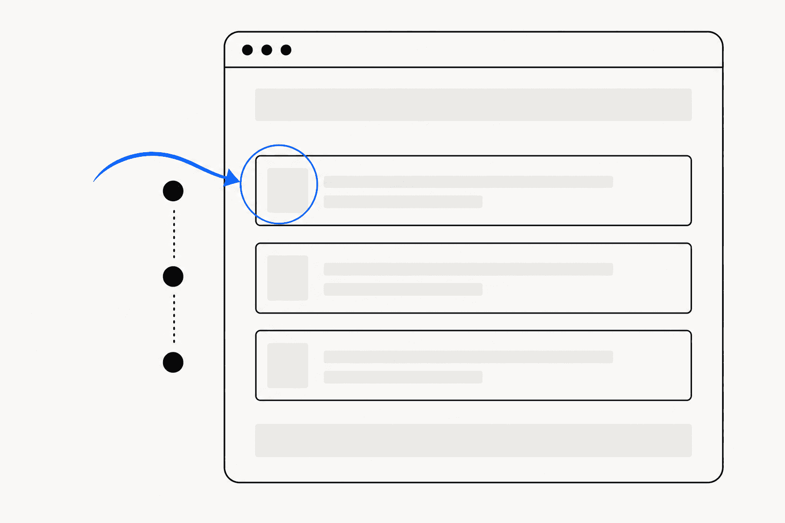
Ten red arrows on a screenshot communicate exactly as much as zero. The hard part of how to annotate screenshots is not drawing the marks — any tool can draw a box — it is deciding what the reader looks at first, what they look at second, and what they never need to see. Treat annotation as editing and most of the usual mistakes disappear on their own.
This guide covers the four tools that do real work — arrows, highlights, numbered step badges, and redaction — and the placement rules that make each one land. The principles apply in any editor; where a concrete example helps, it references ReadyStill, a Chrome extension that ships all four as a finishing pass after capture.
Annotation is editing, not decoration
A reader gives a screenshot about a second before deciding whether to study it or scroll past. Every mark you add spends part of that second. Two marks compete. Five marks cancel each other out.
The governing rule is one primary signal per image: one arrow, or one highlight, or one numbered sequence — not all three stacked on the same capture. If you genuinely need to point at four separate things, that is either four images or one image with step badges, which convert clutter into order.
The second rule is a contrast budget. Red demands attention, so it must be rare — a red box around everything means nothing is urgent. Spend high contrast on the one element that matters and let neutral tones carry the rest.
How to annotate screenshots with arrows
An arrow earns its place when the target is small, specific, and surrounded by similar-looking elements — one toggle in a settings list, one cell in a table. If the target is a large region, an arrow is the wrong tool; reach for a highlight instead.
Four placement rules cover almost every case:
- Start from whitespace. An arrow that launches from empty margin and travels into the interface reads instantly. An arrow that crosses other UI on its way to the target adds noise exactly where you were trying to remove it.
- Curve it. Straight horizontal or vertical arrows disappear into the straight lines of the interface. A gentle curve reads as a human gesture, distinct from anything the UI drew itself.
- Taper it. A thick tail narrowing to a fine head makes direction legible at a glance, even at thumbnail size.
- Stop short. End the arrow a few pixels before the target so the head never covers the thing it points at.
This is why ReadyStill draws its arrows tapered and curved, in three sizes and a five-colour palette: accent blue, ink, white, red, and amber. Choose the colour by contrast against the screenshot, not by habit — white arrows carry well on dark interfaces where ink vanishes. One arrow per image is the ceiling in most cases, and the payoff is real: on a bug report, a single well-placed arrow replaces a paragraph of "in the top-right corner, under the avatar" prose.
Pick the right highlight: spotlight, marker, or box
Highlights answer a different question than arrows. An arrow says look here; a highlight says this region is the subject. Three modes cover the range, and ReadyStill ships them as spotlight, marker, and box.
Spotlight dims everything outside the chosen region. It is the strongest instrument — the reader cannot look anywhere else — and the right choice when the target sits inside a dense interface. Marker works like a highlighter pen across a line of text or a label: strong enough to pull the eye, light enough to leave the text readable. Box outlines a region without touching the pixels inside it; it is the quietest of the three and suits large areas where dimming would feel heavy-handed.
| Tool | What it does | Reach for it when |
|---|---|---|
| Curved arrow | Points at one precise target | The target is small and surrounded by lookalikes |
| Spotlight | Dims everything outside a region | The interface is busy and focus must be total |
| Marker | Draws the eye along text | You are referencing a label, value, or sentence |
| Box | Outlines a region, pixels untouched | The subject is large or dimming feels heavy |
| Step badges | Impose a reading order | One image must explain a sequence |
| Redaction | Removes information | Anything private appears in frame |
When in doubt, use the quietest highlight that still does the job. Escalate from box to marker to spotlight only when the level below fails.
Number steps in reading order
When one image must explain a sequence — fill this field, then flip this toggle, then save — numbered step badges beat a swarm of arrows. Badges impose order; arrows can only point.
Two rules keep sequences legible. First, follow the natural scan path: number from top-left to bottom-right, the direction the eye already travels. Whenever badge 2 sits above badge 1, every reader silently re-reads the image. Second, cap the count at 5 per image. A 9-step annotated screenshot is a poster, not an instruction — split it into stages, each with its own capture, the way long-form documentation does.
Badges carry the where; the surrounding text carries the what. Pair each badge with a matching numbered list in the doc or ticket, and keep badge sizes uniform — mixed sizes read as a hierarchy you did not intend.
Redact before you point
Annotation concentrates attention, and that includes attention on whatever sits next to the target. The email address in the account menu, the API key in a sidebar, the customer name in row 3 — an effective arrow makes bystander data more visible, not less.
So redaction comes before annotation in a sane workflow. Two methods hold up: a solid bar, which removes the information entirely, and pixelation, which hides content while signalling that something structured was there. Blur sits below both — heavy blur is a solid bar with extra steps, and light blur can sometimes be reversed.
Because eyeballing every capture is unreliable, ReadyStill runs a privacy review locally: it detects emails, phone-like values, and credential-like fields, suggests areas to redact, and shows a privacy count before you share. Every pixel is processed in the browser and never uploaded. You can install ReadyStill and test the review on your next capture; the free plan includes 10 exports. For the fuller treatment — what to redact and why cropping is not redaction — see the guide on redacting sensitive information in screenshots.
The 30-second annotation check
Before exporting, run the image past six questions:
- Is there one primary signal, and is it the first thing visible at thumbnail size?
- Does every arrow start in whitespace, curve, and stop short of its target?
- Is the quietest sufficient highlight in use — box before marker before spotlight?
- Do step badges run top-left to bottom-right, with 5 or fewer per image?
- Is anything private visible near the marks, now that the marks will draw eyes there?
- Would the image still make sense with its caption deleted?
If all six pass, the annotation is doing its job: the reader looks where you decided, in the order you decided, and nowhere else. Framing and background treatment come next — covered in how to make screenshots look professional.
Common questions
How many annotations should one screenshot have?
One primary signal — a single arrow, one highlight, or one numbered sequence. If you need to point at several unrelated things, split them across multiple images. Step badges are the exception: up to five on one image, because they impose order rather than compete for attention.
What colour should screenshot annotations be?
Choose by contrast against the capture, not by preference. Ink or accent blue reads well on light interfaces, white works on dark ones, and red should be reserved for warnings so it keeps its urgency. Use one colour consistently across a document.
Should I blur, pixelate, or black out sensitive information?
A solid bar is safest because it removes the information entirely. Pixelation is acceptable when you want to show that structured content exists without revealing it. Avoid light blurs — they can sometimes be reversed, and heavy blur has no advantage over a bar.
Do annotations stay sharp when an image is resized?
They do if the export is rendered at high resolution. ReadyStill renders exports at 2x, so arrows and badges stay crisp when a social platform or blog scales the image down. Annotate once and export large rather than re-annotating after downscaling.