Screenshots for documentation
Readers trust docs whose screenshots look deliberate and current. Consistency is the whole game.
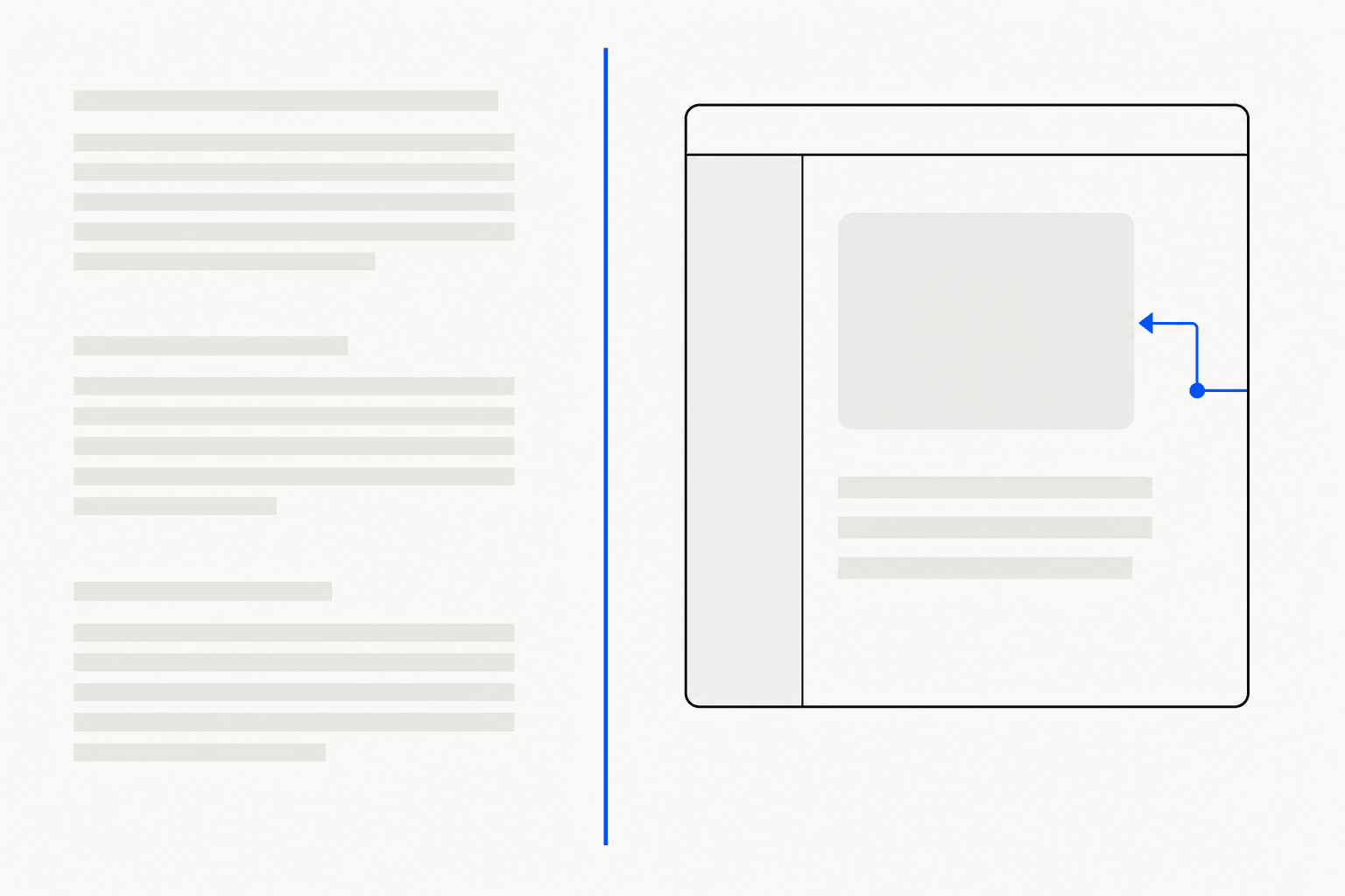
Documentation screenshots carry more trust than the words around them. A reader following a tutorial compares your image against their own screen before they finish reading the step; when the two match, they relax and keep going. When the screenshot shows last quarter's UI, or wears a different style from the image above it, they start second-guessing every instruction on the page.
The failure modes are predictable: images go stale, every author captures at a different zoom and window size, customer data slips into frames, and annotations wander between styles. Each one has a cheap, repeatable fix.
Why documentation screenshots go stale
Product UI changes weekly. Docs get reviewed quarterly, if at all. That gap is structural — you will not close it by asking writers to be more diligent. What you can change is the cost of a refresh.
The expensive part of replacing a screenshot is rarely the capture. It is everything after: cropping to the right boundary, matching the background treatment used elsewhere, redrawing arrows, re-redacting the same fields. If that finishing pass takes 10 minutes per image, a 40-image tutorial never gets refreshed. Get finishing down to under a minute per image and refreshes actually happen.
Two habits help. First, keep a capture note per page — the URL, the element captured, the annotations applied — so anyone can reproduce an image without archaeology. Second, standardise the finishing steps with tooling rather than a style-guide PDF nobody opens.
Capture the element, not the window
A full-window screenshot buries the subject. Bookmarks bar, 14 tabs, an unrelated sidebar — a reader on step 3 needs the settings panel, not a tour of your desktop. Scope every capture to the smallest region that still gives orientation.
There are 4 sensible scopes for docs work, and ReadyStill exposes each as a capture mode: choose an element by clicking it, draw a region, grab the visible page, or take a full-page scroll-and-stitch capture (beta, processed locally).
| Capture mode | Best for in docs | Watch out for |
|---|---|---|
| Choose element | Step images: a panel, dialog, or card | Tiny elements may need surrounding context |
| Draw a region | Areas without a clean component boundary | Freehand crops drift between refreshes |
| Visible page | Orientation shots at the start of a tutorial | Browser chrome and unrelated UI in frame |
| Full page (beta) | Long reference pages and settings indexes | Too tall for inline step-by-step use |
Element capture is the default for step images because it crops at the component's natural boundary — no pixel-eyeballing, and the crop lands in the same place when you re-capture next quarter. For long reference pages, the full-page screenshot guide covers when stitching helps and when it hurts.
One look across every image
Mixed screenshot styles read as neglect. One image floats on white, the next has a grey gradient from an old tool, a third is a raw capture with macOS window shadows. Each is fine alone; together they say nobody owns this page.
Pick one background and framing treatment and apply it to every image in the docs. In ReadyStill, Auto Style does this with a single click by matching a curated look to the screenshot; of the 6 looks, the quieter ones — Clean and Air — suit documentation, where images should support the text rather than compete with it. Whichever treatment you pick, name it in your docs style guide so contributors stop improvising. To try it on a live page, install ReadyStill and restyle one existing tutorial image.
Export consistency matters as much as visual consistency. PNG exports render at 2×, so images stay sharp on high-density displays, and the 1600×840 blog-hero size drops cleanly into most docs layouts. Copy to clipboard for a quick paste into your CMS, or download the PNG when images live in version control next to the docs source.
Annotations readers can follow
An annotation is a promise: look here, then do this. Docs annotations fail by over-decorating — 5 arrows, 3 colours, a starburst — and by under-annotating: a full panel with no hint of which control the step means. The rules that hold up:
- Numbered step badges must mirror the written steps exactly. Badge 2 on the image is step 2 in the text — never approximately.
- One arrow per image, pointed at the click target. A tapered curved arrow reads as deliberate; a straight default arrow reads as an afterthought.
- Use a spotlight highlight on busy screens: it dims everything except the area that matters, which beats a box outline when the UI is dense. Marker and box modes cover lighter emphasis.
- Stay inside a small palette — accent blue, ink, white, with red reserved for warnings — and one size scale.
The annotation guide goes deeper on arrow placement and when each highlight mode earns its keep.
Redact customer data before it ships
Documentation screenshots leak data in 2 ways. Writers capture staging environments seeded with realistic records, and support teams promote real troubleshooting screenshots into help-centre articles — names, emails, and account IDs intact. Both end up public and indexed.
Redact in the image itself before export — not with a box added in the CMS that a right-click can bypass. Two methods work: a solid bar, which is unambiguous and safe, and pixelation, which preserves layout so readers can still tell a field was populated. ReadyStill's privacy review runs locally and flags emails, phone-like values, and credential-like fields, suggesting areas to redact and showing a privacy count before you share. All screenshot pixels stay in the browser — nothing is uploaded — which is the answer your compliance team wants when they ask where doc images go.
The habits here overlap heavily with support screenshots, where real customer data is the norm rather than the exception. For method details, see the redaction guide.
A pre-publish checklist
Before a screenshot ships in your docs, confirm 6 things:
- Current: it matches the UI as of today, not last quarter.
- Scoped: element or region capture; the subject fills the frame.
- Consistent: same background treatment as its neighbours.
- Annotated: badges match the written steps; at most 1 arrow.
- Clean: the privacy count is 0 and no realistic data survives.
- Reproducible: the capture is noted so the next refresh is cheap.
None of these takes long on its own. Made cheap and habitual, they compound into documentation that readers trust on sight — which is the entire reason to put images in docs at all.
Common questions
How often should documentation screenshots be updated?
Review them whenever the UI they show changes materially, and audit high-traffic pages at least quarterly. The realistic way to sustain this is to make each refresh cheap: scope captures to elements so re-captures land identically, and use one-click styling so finishing takes seconds rather than minutes.
What size should screenshots be in documentation?
Match your docs layout's content width and export at 2× the display size so images stay sharp on high-density screens. ReadyStill renders PNG exports at 2× automatically, and its 1600×840 blog-hero size fits most documentation and blog content columns.
Should I redact fake data in staging screenshots?
Yes, if it looks real. Readers cannot tell seeded records from customer data, and a realistic email or account number in public docs invites confusion and phishing. ReadyStill's privacy review flags emails, phone-like values, and credential-like fields locally before export, so the pass costs seconds.
Is element capture better than cropping a full screenshot?
For documentation, yes. Element capture crops at the component boundary automatically, which keeps the subject consistent across authors and across refreshes. Manual cropping drifts a few pixels every time, and the drift shows when images sit side by side on the same page.