Screenshots for social media posts
The feed is a contrast war. A finished screenshot wins it before the first word is read.
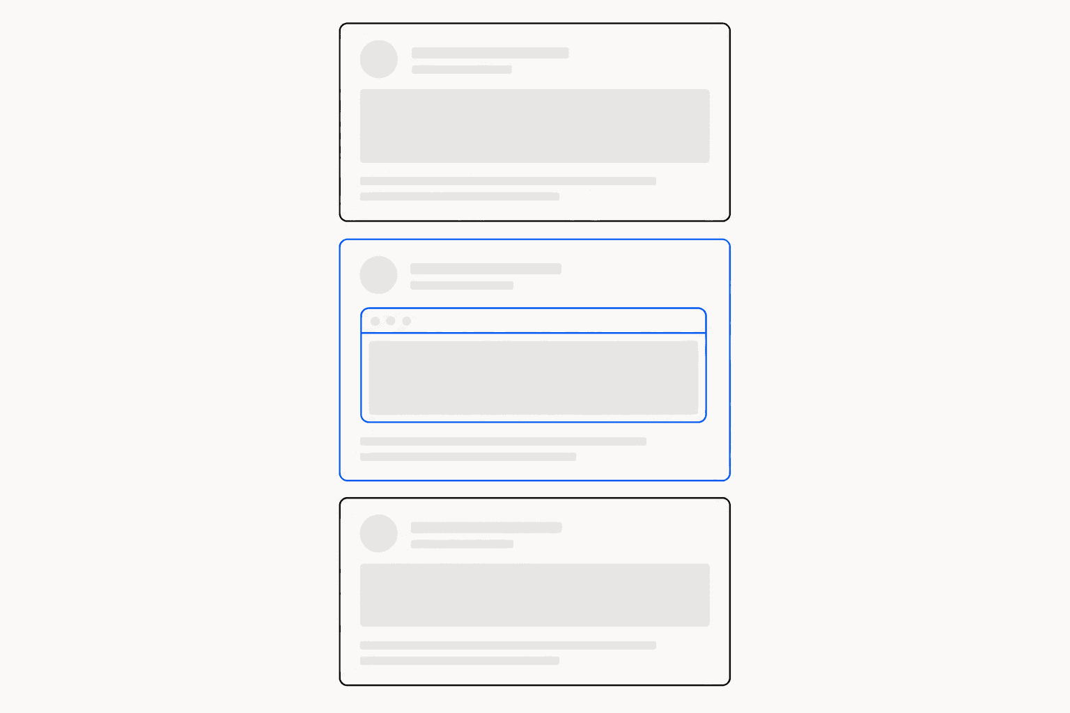
Screenshots for social media compete under conditions your editor never shows you: downscaled to a few hundred pixels wide, recompressed, and stacked between posts fighting for the same glance. A reader decides whether to stop in well under a second, and that decision runs on shape and contrast, not content. Most raw screenshots lose it instantly — white UI on a white feed card has no edge, no focal point, no reason to pause. The fix is not better copy. It is finishing the image before you post it.
Why raw crops die in the feed
Three failure modes account for almost every ignored screenshot post.
- No edge. Most product UI is white or light grey, and so are most feed themes. A raw crop bleeds into the post background until it stops reading as an image at all. On dark mode, the same crop becomes a glowing rectangle that looks like a mistake.
- Wrong ratio. Platforms crop what does not fit. A tall settings page posted as-is on X gets chopped to a strip of toolbar; a wide dashboard viewed on a phone renders as a sliver nobody can read.
- Too dense. A full-window capture packed with navigation, sidebars, and body text is illegible at 400 pixels wide. If the reader has to open the image to understand it, most never will.
Compression makes all three worse. Feed pipelines re-encode images aggressively, and the first casualties are exactly what raw screenshots depend on: 1-pixel borders, light grey text, subtle shadows. Whatever structure your image has must survive being small and slightly mangled.
Framing screenshots for social media
The reliable fix is to stop posting the screenshot as the image and start posting a composition that contains it. Three moves do most of the work.
- Crop to the point. Capture the panel, card, or state you are talking about — not the whole window. Element-level capture beats cropping a full-page shot after the fact.
- Put it on a stage. Surround the crop with a background field that contrasts with both light and dark feed themes. Padding alone separates it from the platform chrome.
- Give it an edge. Rounded corners and a visible border make the screenshot read as a deliberate object rather than an accidental fragment.
A dark canvas is the strongest version of this: light UI on a dark stage has guaranteed contrast in every feed theme. This is the step ReadyStill automates — capture an element or a drawn region, and Auto Style matches one of six curated looks in a click. Midnight puts light UI on a dark canvas; Clean and Air keep the stage quiet for screenshots that carry their own colour. Every pixel is processed locally in the browser, so nothing you capture is uploaded. You can install ReadyStill and test the difference on your next post — the first 10 exports are free.
Match the ratio to the placement
Aspect ratio decides how much screen your post occupies, which on mobile is most of the game. A 16:9 landscape image fills roughly half the vertical space of a 4:5 portrait at the same width, so portrait buys more feed real estate — but only when the content is genuinely tall. Stretching a wide dashboard into 4:5 spends the extra pixels on empty canvas.
| Placement | Ratio | Export size |
|---|---|---|
| X timeline | 16:9 | 1600×900 landscape |
| LinkedIn or Instagram feed | 4:5 | 1080×1350 portrait |
| Carousels, mixed feeds | 1:1 | 1080×1080 square |
| Link preview cards | 1.91:1 | 1200×630 Open Graph |
| Blog or newsletter hero | ~1.9:1 | 1600×840 hero |
ReadyStill's Launch Pack renders six sizes from one finished screenshot as a single ZIP, exported at 2× resolution — the 1600×900 landscape ships as 3200×1800 pixels — so feed downscaling sharpens the image rather than blurring it. For per-platform dimensions in depth, see the screenshot sizes for social media guide.
Annotate for the thumbnail, not the close-up
An annotation that looks tasteful at full size disappears at feed size. Work by one rule: one image, one point.
- Pick one device of emphasis. An arrow or a highlight, not an arrow plus a box plus underlines. A spotlight highlight — dimming everything except the region that matters — is the strongest choice at small sizes because it changes the contrast of the whole image, not one corner.
- Size up. Marks that feel oversized in the editor are correct for the feed. In ReadyStill terms, choose size L over size S for anything bound for a timeline.
- Spread step badges across a thread, not within an image. Steps 1, 2, and 3 as separate posts, each carrying one numbered badge, beat one image with five callouts.
The full logic of tapered arrows, highlight modes, and step badges is covered in how to annotate screenshots.
Redact before you post, not after
A social post is permanent in a way a Slack message is not. Screenshots taken from a live account leak emails in navbars, customer names in tables, and tokens in URL bars — and deleting the post does not delete other people's screenshots of it. Run a deliberate pass before export: a solid bar removes information outright, while pixelation obscures it and preserves the layout. ReadyStill's privacy review performs this check locally, flagging emails, phone-like values, and credential-like fields, and shows a privacy count before you share. The full workflow is in how to redact sensitive information in screenshots. For launch-day posts, where a leaked internal URL travels furthest, pair it with the product launch playbook.
The pre-post pass
Thirty seconds before you hit post, check 5 things.
- Edge: the image separates cleanly from both a white card and a dark one.
- Ratio: the crop matches the placement — portrait for LinkedIn and Instagram, landscape for X, 1.91:1 for the link card.
- Point: exactly one thing pulls the eye, emphasised by one device.
- Legibility: the key text reads at phone width without opening the image.
- Privacy: a redaction pass has covered emails, names, and URLs.
An image that passes all five is finished. Everything after that is the words.
Common questions
What size should screenshots be for social media?
Match the placement, not one universal size. Use 1600×900 landscape for the X timeline, 1080×1350 portrait for LinkedIn and Instagram feeds, 1080×1080 square for carousels, and 1200×630 for link preview cards. Export at 2× resolution so feed downscaling sharpens the image instead of blurring it.
Why do my screenshots look bad in the feed?
Usually one of three reasons: no edge contrast against the feed background, an aspect ratio the platform crops, or too much dense UI to read at phone width. Feed compression then erases thin borders and light grey text, which is exactly what raw screenshots rely on.
Should I use portrait or landscape screenshots on LinkedIn?
Portrait 4:5 occupies roughly twice the vertical screen of a 16:9 landscape at the same width, so it earns more attention on mobile. Use portrait when your content is genuinely tall; a wide dashboard forced into 4:5 wastes the extra space on empty canvas.
How do I keep private data out of screenshots I post?
Run a deliberate redaction pass before export, not after posting — deleted posts survive as other people's screenshots. ReadyStill's privacy review locally detects emails, phone-like values, and credential-like fields, suggests areas to redact as a solid bar or pixelation, and shows a count before you share.