How to make screenshots look professional
The gap between a raw capture and a published visual is five deliberate finishing steps. Here is each one.
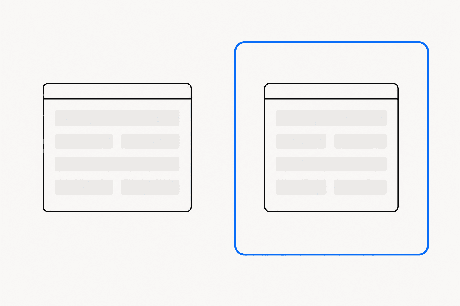
Most screenshots fail at the finish, not the capture. The pixels are sharp enough; what is missing is the 20 seconds of finishing work that separates a pasted screen grab from a published visual. Knowing how to make screenshots look professional comes down to 5 deliberate moves: a tighter capture, real padding, a consistent background, restrained annotation, and export at the size the destination actually wants. Each one is mechanical. Together they are the difference between an image people scroll past and one they read.
Capture less than you think
A professional screenshot starts with a decision about what to exclude. The full browser window carries tabs, bookmarks, extension icons, and a URL bar full of query strings — none of which your reader needs, all of which date the image and leak context. Crop to the unit of meaning: the card, the panel, the dialog, the chart.
Capture mode matters more than people expect, because it decides how much cleanup follows.
| Capture mode | Best for | Watch for |
|---|---|---|
| Choose element | A single card, panel, or dialog | Hover states changing before the click |
| Draw a region | Precise crops across components | Uneven margins when drawn freehand |
| Visible page | Full-viewport context | Browser chrome and open tabs in shot |
| Full page | Documentation and archives | Too tall for social feeds |
Element capture is the underrated one. Clicking a component and getting a pixel-perfect crop of exactly that panel removes the shaky-hand problem entirely — ReadyStill's choose-element mode does this, alongside region, visible-page, and a beta full-page capture that scrolls and stitches locally. For long pages, see the guide to full-page screenshots in Chrome; for everything else, capture the smallest region that still makes sense on its own.
Padding and background do most of the work
Set a raw crop next to a finished one and the difference is almost entirely negative space. A capture with content running to every edge looks like evidence. The same capture with even padding, a soft background, and a rounded frame looks like it was made on purpose.
The rules are short. Padding should be even on all sides and generous — thin borders read as accidental. Backgrounds should be quiet: a soft neutral or a gentle tint, never a loud gradient fighting the content. And the screenshot itself needs a defined edge — a rounded corner and a clear frame line — so it separates from whatever the platform renders behind it. White-on-white screenshots dissolve into the page; a frame keeps the boundary honest.
Pick one look and repeat it
One good-looking screenshot is easy. Twelve consistent ones — across a changelog, a docs section, a launch thread — are what read as professional. Consistency means the same background treatment, the same padding ratio, the same corner radius, and the same annotation colour, every time.
The practical way to get there is to stop restyling from scratch. ReadyStill ships 6 curated looks — Clean, Air, Bloom, Editorial, Midnight, and Proof — plus an Auto Style button that matches a look to the screenshot in one click, so a set of images stays coherent without manual matching. Whatever tool you use, decide the look once and treat it as a template. Teams shipping changelogs or documentation feel this fastest: readers notice a style change before they notice a feature change.
Annotate with restraint, redact without mercy
Annotation is where finished screenshots most often go backwards. The failure mode is decoration: 5 arrows, 3 colours, a box around everything. Professional annotation makes exactly one claim per image.
- One arrow pointing at the one thing that matters. Tapered, slightly curved arrows read as drawn intent; thick straight ones read as clip art.
- A spotlight highlight — dimming everything except the target — when the surrounding UI is busy. It beats a red box because it removes competition instead of adding it.
- Numbered step badges when you are showing a sequence, so reading order is explicit.
Redaction is the other half. An email address, an API key, or a real customer name in a published screenshot is a credibility problem before it is a privacy one. Use a solid bar or coarse pixelation rather than a light blur you cannot fully trust. ReadyStill runs a local privacy review that flags emails, phone-like values, and credential-like fields before export and suggests areas to redact — a useful backstop, but the habit matters more than the tool. There are deeper guides on annotating screenshots and redacting sensitive information if you want the full treatment.
How to make screenshots look professional at any size
The final unprofessional tell is softness: an image exported at one size and stretched into another. Every platform crops and compresses differently, and a screenshot that shipped sharp on a blog will ship blurry on X if it left at the wrong dimensions.
Two rules cover almost everything. First, export at the destination's native ratio instead of letting the platform crop for you. Second, export at 2× the display size, because feeds downscale and screens are dense — a 1600×900 slot wants a 3200×1800 file. The exception is the Chrome Web Store, which requires exactly 1280×800.
Doing this by hand 6 times per image is tedious, which is why ReadyStill's Launch Pack export renders all 6 sizes as a single ZIP at 2×, with the Web Store size kept exact. If you publish to more than one channel, install ReadyStill and export once; the full cheat sheet lives in the screenshot sizes for social media guide.
The 5-step finish
Run every screenshot through the same pass before it ships:
- Crop to the unit of meaning — element or region, not the whole window.
- Add even padding and a quiet background with a defined frame.
- Apply your one house look; do not restyle per image.
- Make one annotation claim, and redact anything you would not read aloud.
- Export at the destination ratio, at 2×.
The whole pass takes under a minute once the defaults are set. That minute is the entire gap between a screen grab and a visual that looks like your product deserves it.
Common questions
What makes a screenshot look unprofessional?
The usual tells are content running to every edge, a full browser window with tabs and URL bar visible, more than one annotation colour, and softness from exporting at the wrong size. Fixing crop, padding, and export size resolves most of it in under a minute.
Do I need a design tool to make screenshots look professional?
No. Padding, backgrounds, framing, and sizing are mechanical steps, and a finishing extension can apply them in the browser. ReadyStill does this locally in Chrome — screenshot pixels are processed on your machine and never uploaded.
What size should a professional screenshot be?
Match the destination: 1600×900 for landscape social posts, 1200×630 for Open Graph link previews, 1080×1080 or 1080×1350 for feeds, and exactly 1280×800 for the Chrome Web Store. Export at 2× the display size so downscaling keeps the image sharp.
Should screenshots have a border or background?
Yes. A defined frame stops a white screenshot dissolving into a white page, and a quiet background with even padding signals the image was finished on purpose. Keep the same treatment across a set so the images read as one system.